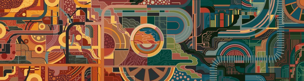
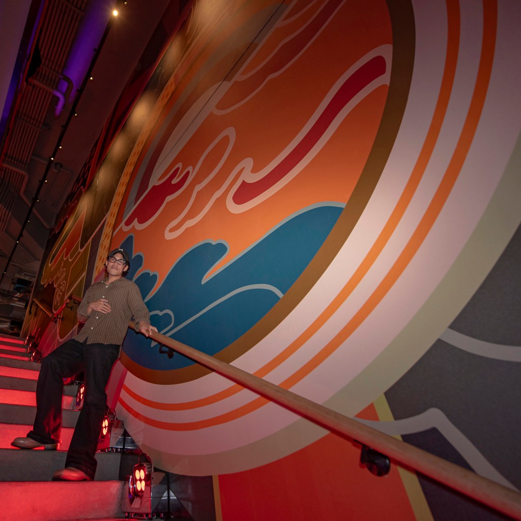
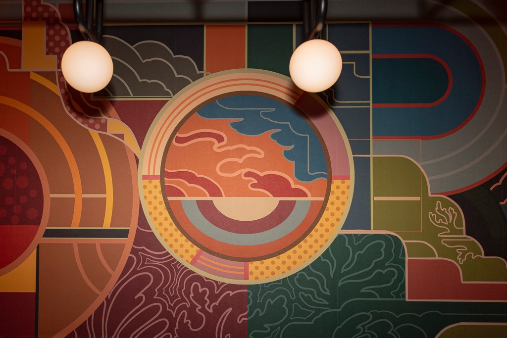
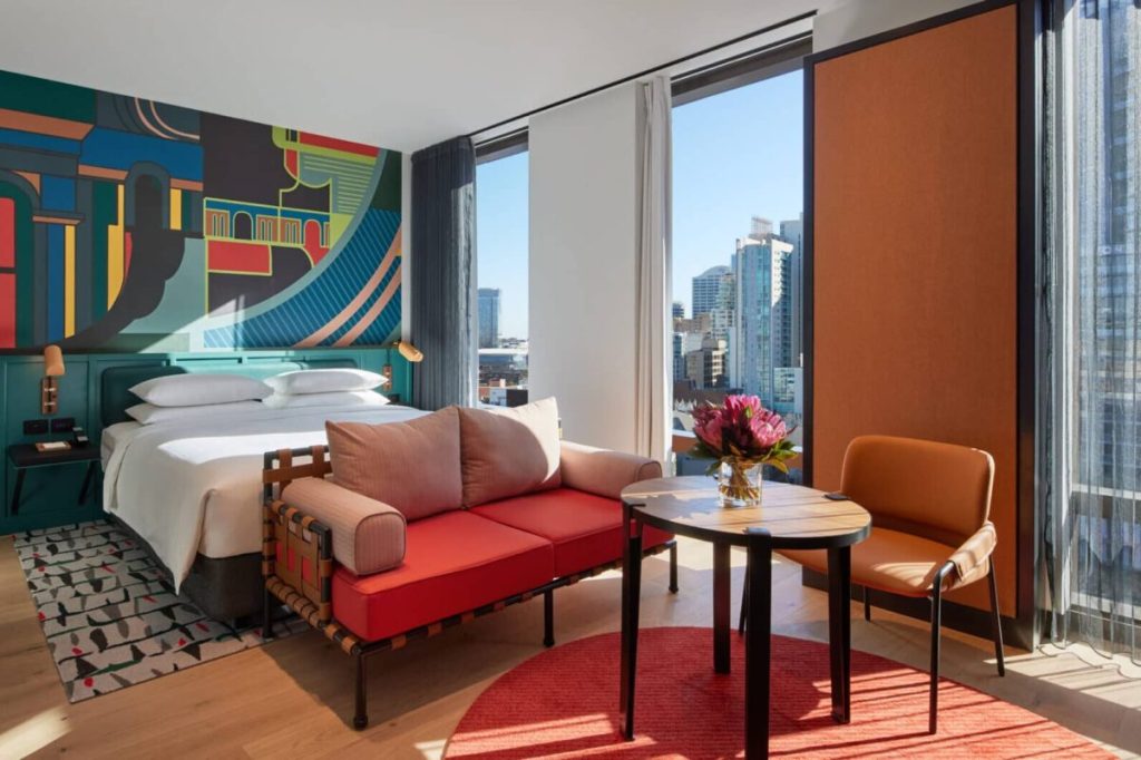
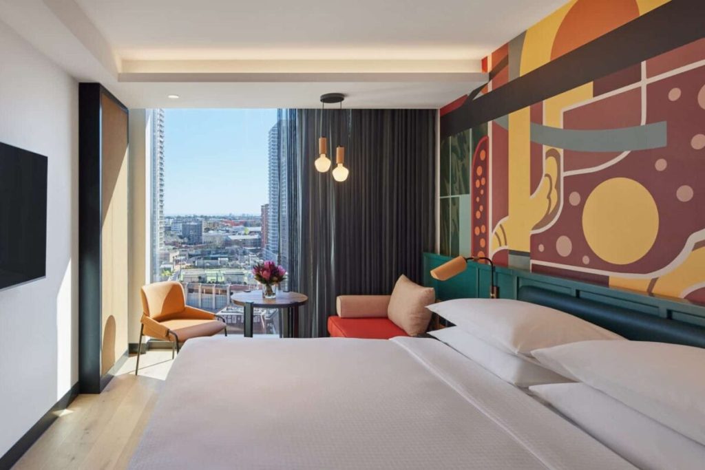
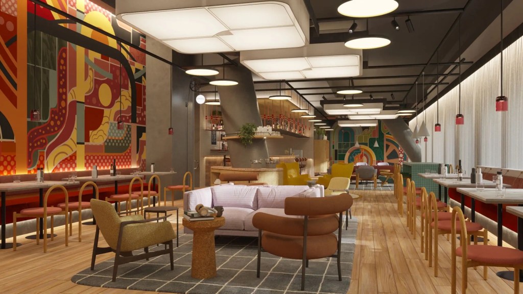
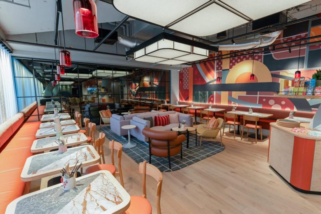
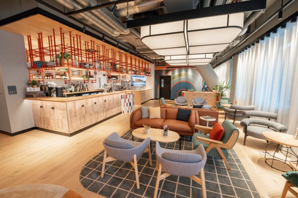
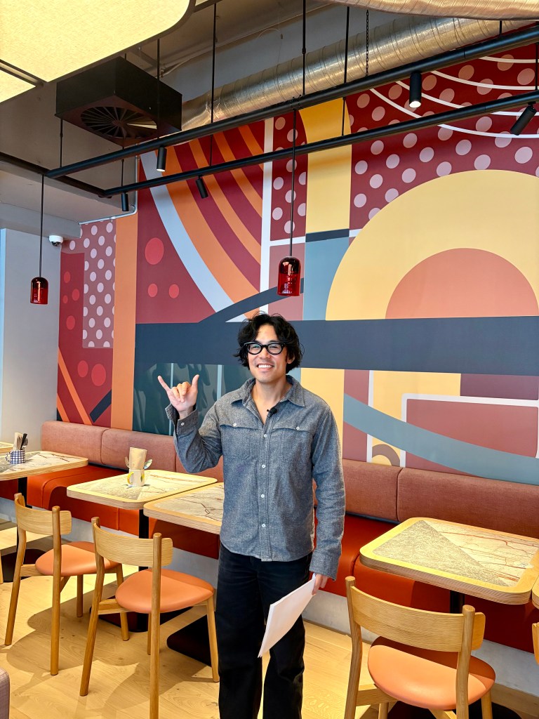
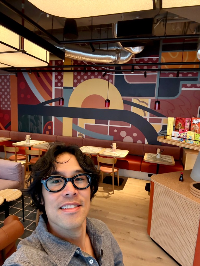
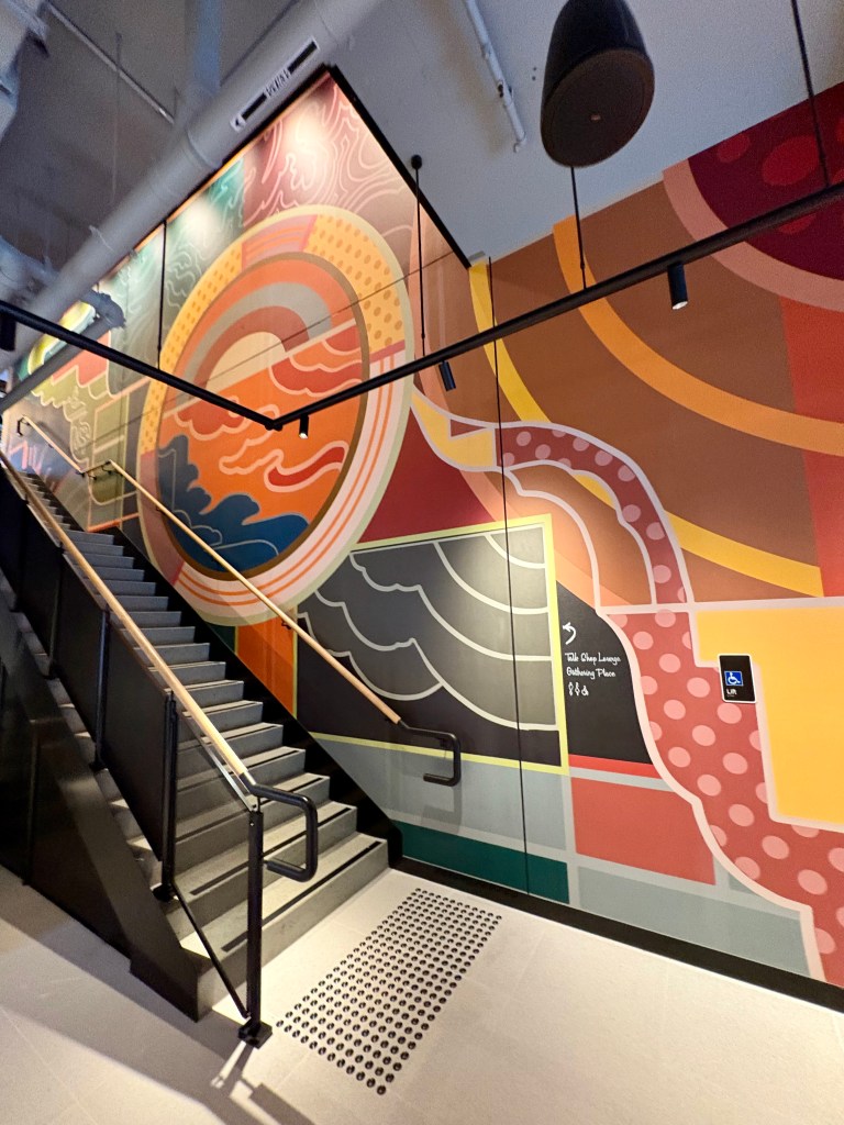
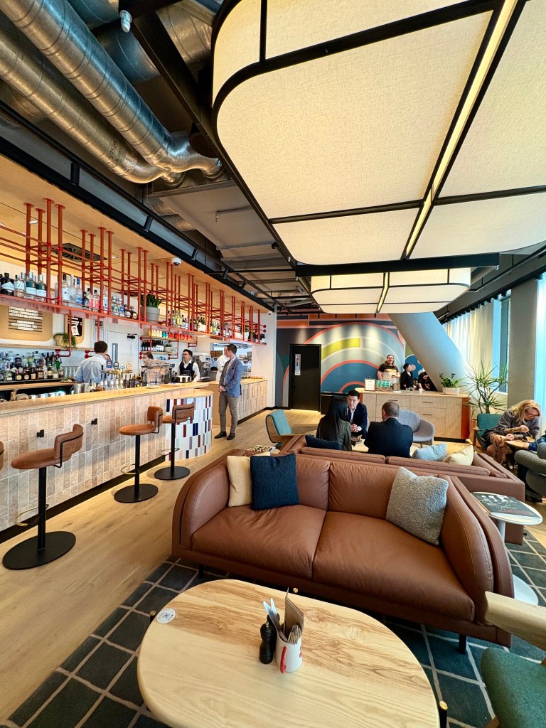
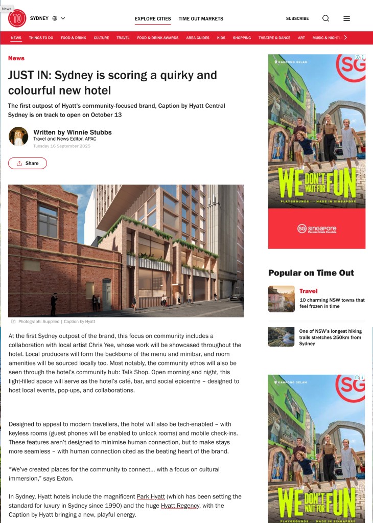
Very honoured to be asked to create the hero artwork for the Sydney Haymarket Caption by Hyatt Branch. The artwork is feautured throughout the lobby, talk shop and bedrooms.
Thanks to Red T Multiples team for having me on the project, it’s looks vibrant and full of energy in the heart of Haymarket .
I view the Hotel as a bridge between the future and past of the Haymarket area. I see Chinatown as the ‘centre of the universe’ of Sydney, an area identified by a cross-section of shared stories, histories, culture and community. Geographically a connecting point between our iconic Central station and famous Town Hall.
Located close to the harbour, the area was attractive for farming and trade leading many journeymen and migrants to the area. This came with a grand exchange of food, industry and technique from Chinese communities and the outside world. The area treated these people like family, and it’s this same comfort that I see encapsulated in the ideals of the Caption by Hyatt, Haymarket.
Notable Historical moments include: the Brickfields, Paddy’s Market (literally a Haymarket) The Belmore markets (1893),The Wirth’s Brother’s Hippodrome (1913-1917), now Capitol Theatre and the Wing Sang and Co, Chinese owned import business and building (1890-1984)
In a bubble, Haymarket feels far more global and open to exchange and pathways. These same ethos line up with myself as an Australian born Chinese, the redefining nature of what it means to be both and share two cultures.
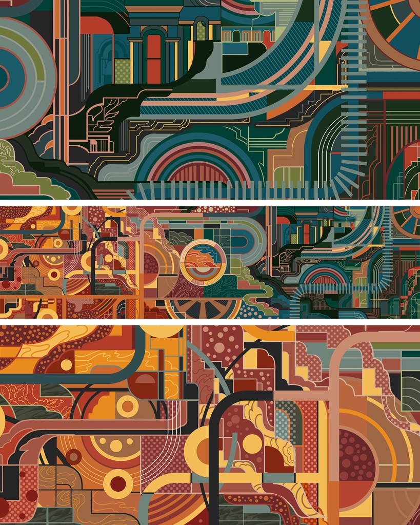
The artwork itself is based on the idea of creating a bespoke dream travel map. I wanted to capture the area’s industrial history while at the same time connect relevancy to the modern Asian-Australian community, with lines, shapes and tracings based around the very first heritage blueprints of the area. I reinterpreted the area’s historical buildings, architectural lines and shapes to create a unique, organic map that was to look like a very modern and international connection system for the area’s future.
Reading from left to right – the ‘red’ areas represent land, migration and agricultural history while the ‘green’ area represents industrial history.